OUR
LOGOS
Below you will find all our logo files, for both print and web use. Please also review the logo guidelines to ensure proper usage of Commonwealth Electric Company of the Midwest’s logo.
ADDITIONAL LOGOS:


PRIMARY LOGO
This is Commonwealth’s preferred logo and should be used whenever possible. Including the tagline is preferred but may be omitted when space does not allow it. In cases where the logo needs to be produced at a smaller size, please see below for more guidelines.
Full color:

Full color with tagline:

Black + white:

Black + white with tagline:

Reversed:

Reversed with tagline:

VERTICAL LOCKUP
This logo may be used in situations where space does not allow the use of Commonwealth’s primary logo.
Full color:

Full color with tagline:

Black + white:

Black + white with tagline:

Reversed:

Reversed with tagline:

HORIZONTAL LOCKUP
This logo may be used in situations where space does not allow the use of Commonwealth’s primary logo.
Full color with tagline:

Black + white:

Black + white with tagline:

Reversed:

Reversed with tagline:

ICON MARK
This logo may be used in situations where space is extremely limited.
Full color:
![]()
Full color with tagline:
![]()
Grayscale:
![]()
Grayscale with tagline:
![]()
Reversed:
![]()
Reversed with tagline:
![]()
COMMONWEALTH COMMUNICATIONS LOGOS
Follow the same guidelines as above.




GUIDELINES FOR USAGE
In order to adhere to our brand guidelines, please only use the logos provided. Do not attempt to recreate any version of the Commonwealth Electric Company of the Midwest logo.
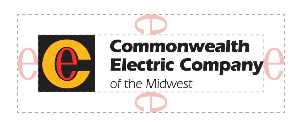
When using our logo, please ensure that you leave a space equal to the width of the icon’s “e” around it.
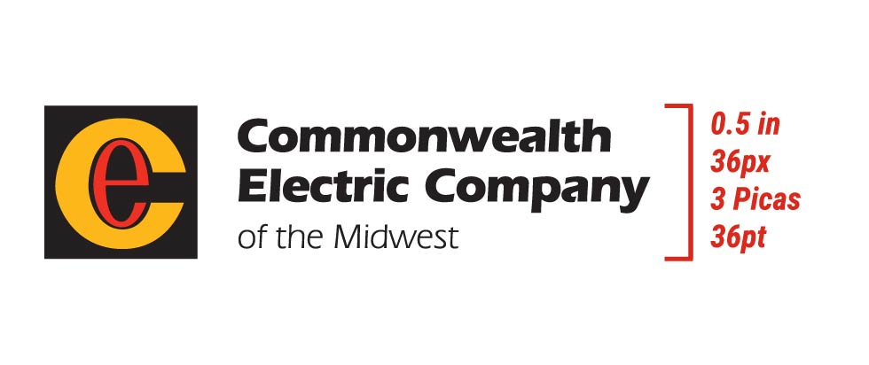
Please ensure that our logo is always produced at a height above 0.5 inches or 36 pixels.

When using our logo, please ensure that you leave a space equal to the width of the icon’s “e” around it.

Please make sure that our logo is always produced at a size above 0.5 inches or 36 pixels.
When possible, place the logo on a plain white background instead of using the reversed version.
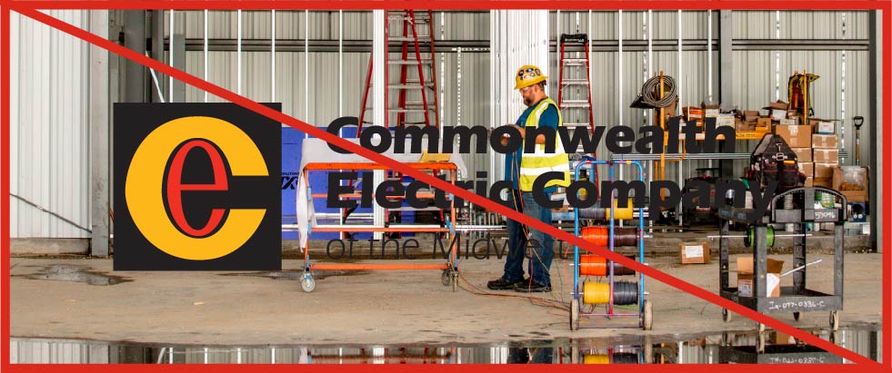
Do not place the logo over a busy background.

When possible, place the logo on a plain white background instead of using the reversed version.

Do not place the logo over a busy background.
ADDITIONAL GUIDELINES:
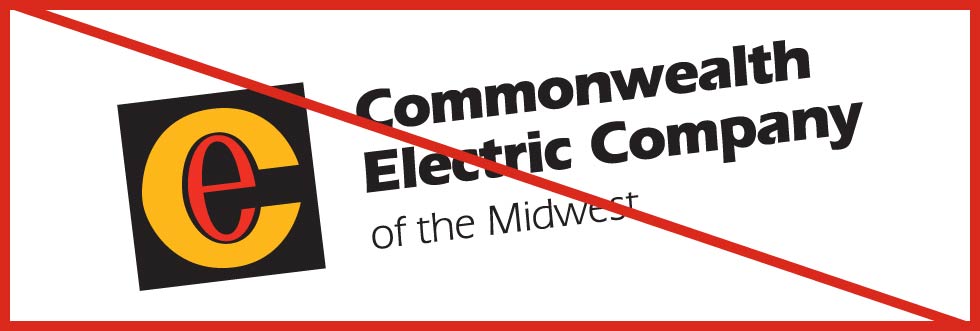
Do not rotate the logo.
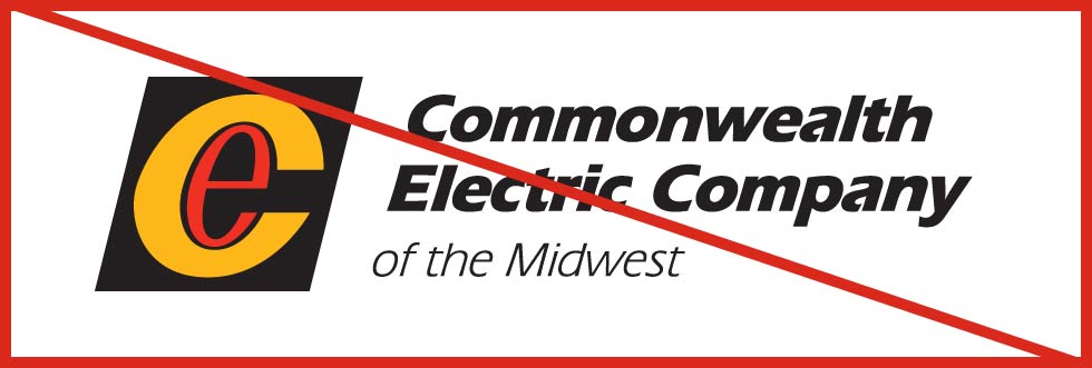
Do not stretch, skew, or otherwise distort the logo in any way.
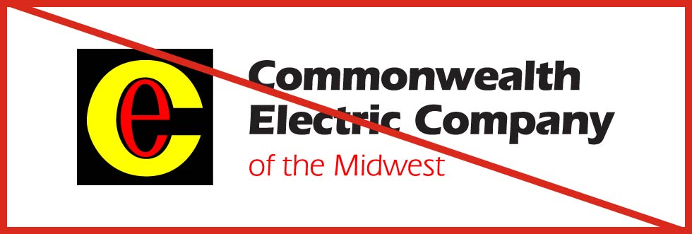
Do not change the color of any part of the logo.
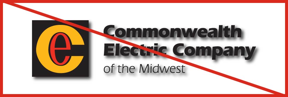
Do not add a drop shadow to the logo.
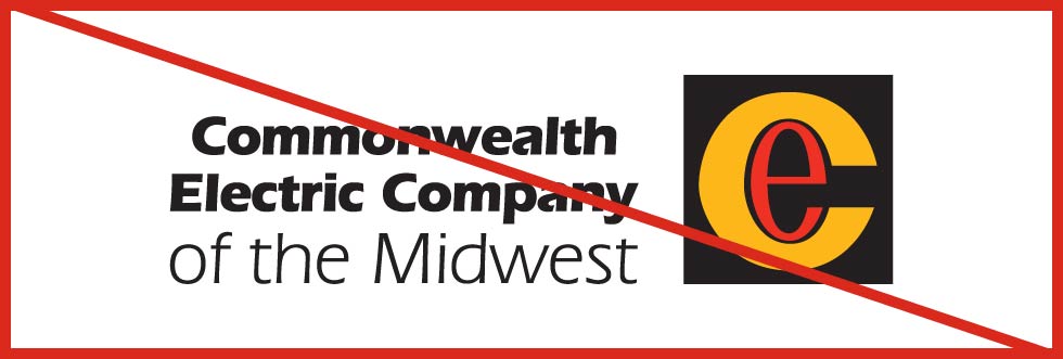
Do not change the size or position of any of the logo’s elements.
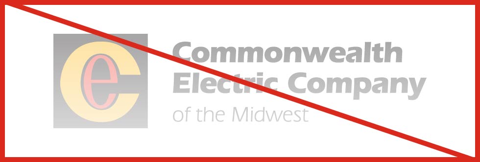
Do not change the transparency of the logo.
Do not remove any part of the logo.
Do not recreate any part of the logo using a different typeface.
When using the reversed logo, do not add additional colors.
Didn’t find what you’re looking for? Please contact the Marketing team with any questions you may have.


